Have you ever wondered why Apple used black and grey as its brand colour? Or why Google used multiple colours for its logo? The answer is pretty simple – to make the logo eye-catching and aesthetically pleasing. Today, when we think of Apple, the image that comes to our mind is – bitten black apple on the background of an iPhone. This black icon is a symbol of style, technology, quality and excellence. The logo design is the ultimate game-changer here. According to research, 92% of people acknowledge that visual appearance is the most persuasive marketing factor overall.
Whether you’re bootstrapping a business or planning to change your brand logo, understanding the impact of brand colours on consumer behaviour will help you skyrocket your business. In this ultimate guide, we’re going to confabulate on how to pick the right brand colour. Stride along with this article till the end.
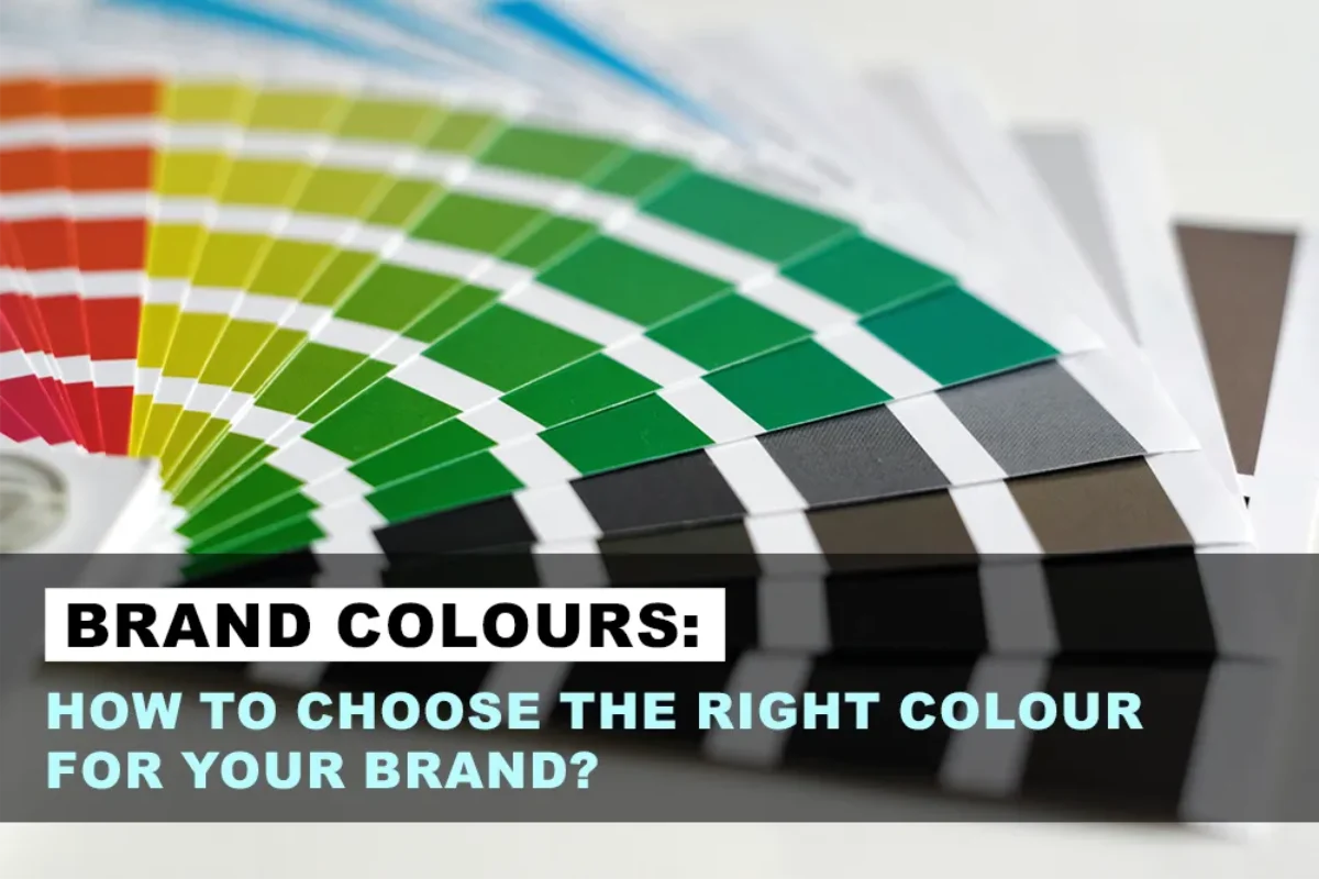
Why are brand colours requisite?
The famous adage – ‘The first impression is the last impression,’ is an axiomatic truth when it comes to your brand. Why? Because brand colour is the first thing, customers see. The psychology behind colours is that they evoke emotions, feelings and easily convey information. A brand colour enables customers to form a primary impression even without knowing what your product is all about. In this fast-paced digital world, brand colour has become a key pillar of branding and marketing. Further, brand colours help customers decide whether or not to engage in your product. Research reveals that 85% of consumers believe that colour is a colossal motivation when choosing a particular brand.
Significant steps to follow while choosing the right brand colour
Colour is considered an essential part of the brand visualisation process. Let us walk you through the important steps that will help you find the best brand colour.

Step 1 – Understand the Concept of Colours
Before selecting any particular colour for your brand, you first need to understand the theory behind each colour. Let us give you a quick summary of every colour:
- Blue – It’s a reliable and trustworthy colour. For example, Facebook.
- Purple – Signifies royalty and majesty. For example, Cadbury chocolate.
- Red – Known for being the colour of love. It also signifies energy and excitement for instance, Coca-Cola.
- Pink – A sentimental and romantic colour. Different shades can be youthful and bold. For instance, Myntra.
- Orange – Associated with creativity and vitality. For instance, Fanta.
- White – Conveys simplicity and innocence. For instance, Samsung.
- Black – Considered to be a sophisticated, formal, luxurious and elegant colour. For example, Apple.
- Yellow – An optimistic colour, which is associated with being playful and happy. For instance, McDonald’s.
- Green – A colour of nature which aligns with prestige and wealth. For example, Sprite.

Step 2 – Recognize your Brand’s Essence
What is brand essence, you ask? Simply put, brand essence means knowing what your brand is all about, the idea, goals and how to target the audience through it. Here are a few things you need to know to find the right brand colour.
- Brand goals – Whether you want your customers to be happy or be more informed? Identifying brand goals will be really helpful in deciding the brand colour.
- Personality traits – How do you consider your brand – fun, inspirational, or formal?
- Target audience – You need to know how you will target your audience. Examine whether you want them to feel confident or positive about your brand.
It’s important to know how you want to be perceived by the customers to further narrow down the brand colour.

Step 3 – Make your Brand Colour stand out
You definitely want your brand colour to stand out or be easily recognisable, right? Undeniably, your products seldom appear among competitors – either online or offline – you don’t want to appear to be the same. You have often seen sunscreen products in yellow and tech companies in blue. Products that look the same easily get neglected. Therefore, you need to think out of the box that can make your brand stand apart.

Step 4 – Create a unique Brand Colour Palette
You might have seen brands with multiple colours. For example, if the brand logo is blue, the website might include red and green colours as well. This is called a brand colour palette, where more than one colour is used that can work together to make an appeal. Selecting a palette for your brand logo is a little tricky task, but you can take help from a graphic design company. The advantage of using the tool is that, it also provides you with colour codes to make things simpler.
How can we help?
Aadharshila is a premier Graphic Design Company in India, providing comprehensive branding solutions, exceptional video production services, social media marketing services, and PPC management services. With expertise in packaging design, brochure design, and logo design, we are dedicated to delivering top-notch creative solutions that elevate your brand’s presence. As a leading Corporate Video Production Company in India, we specialize in producing captivating videos that effectively communicate your message. Additionally, our social media marketing services are designed to enhance your brand’s visibility and engagement across various social media platforms. We employ strategic techniques to maximize your online presence and reach your target audience effectively. Furthermore, our PPC management services ensure that your brand receives optimal visibility through paid advertising campaigns. We handle the entire process, from keyword research and ad creation to monitoring and optimization, to ensure the best return on investment for your PPC campaigns. Serving clients across India, including Ahmedabad, Vadodara, and Surat, we take pride in our ability to cater to diverse geographical locations while maintaining the highest standards of quality and customer satisfaction. Partner with Aadharshila today and unlock the full potential of your brand with our exceptional services.